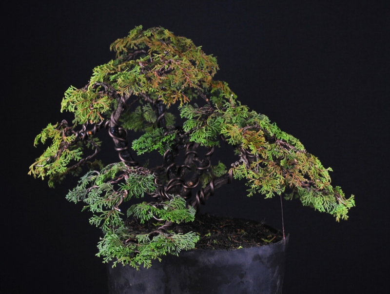
I often wondered what kind of background fits best.
A darker or rather a lighter one.
So i made some pics of a newly designed Hinoki (again) to
have a look at that topic ...
Fell free to leave your choice in the comment-zone below, which background
do you like better?


